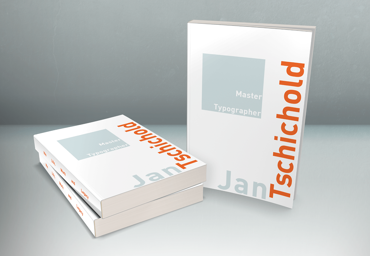
Jan Tschichold Book Cover
After studying the work and design approach of master typographer, Jan Tschichold, we used the same approach to create three book cover designs. Through these designs, we experimented with typographic hierarchy, emphasizing a different aspect for each cover. We also used a photo of Tschichold, along with an image that metaphorically represents his work. We had to use to text and the image together to create a balanced composition.
Here's a link to my process: https://hollybolly.dropmark.com/1183781

Emphasis on name: I tried to convey the spacious and geometric feel of Tschichold's work through this design. I used orange because of the bold colors he uses

Emphasis on subtitle: The clouds once again represent the spacious aspect of Tschichold's work. The white type matches the clouds, but also represents the clean, sharpness of his design style.

The juxtaposition between the serif typeface and the sans serif represents the boldness Tschichold is able to present with simple elements of type.

The texture on the photo adds a depth to the cover next to the sharpness of the type.


